Welcome back to another batch of cards form last Saturday's card show. The first installment featured all things sparkly, today's post of cards that shine, will differ somewhat, but they do ultimately still fit in to the same category, that being... cards of the gaudy variety.
After removing all the cards that are destined to be sent out in care/trade packages, I was surprised by how little was left for me (at least as far as the shiny stuff goes), although looking at it in a glass half full sort of way, taking all those cards out made this post a lot shorter than it would have otherwise been... so that's always a good thing.
I'm sure a number of people are quite familiar with these Artist's Proof parallels from Score's 1997 Showcase series, but I had never seen them before, or at least I don't remember ever having seen them before. While it was cool to finally learn of them, I just wish I could have found more than just these three.
It seems like I'm always able to pick up a couple of needed cards from the Archives Reserve sets at just about every show I go to now, and as you can see, I found a few more from the 2001 edition on Saturday. At fifty cents apiece, these were the only cards in this post that cost more than a quarter. The seller had more that I needed, but a lot of them had some sort of gunk on them, a gunk that didn't seem like it was going to be removable. And if anyone's interested, the Fisk was a duplicate.
I was also able to find two from 2002 edition as well. It's a good thing that I always carry a couple of quarters, because even though this seller had a couple of 3200 ct boxes full of 25 cent stuff, these were the only two cards that I could come up with.
The Topps Season's Best inserts are usually not held in too high of regards by basketball insert collector's, but I've always enjoyed them, and I always enjoy finding stuff that I didn't have, as was the case with this Shareef Abdur-Rahim from the 1998-99 release.
I've said it before, but I'll say it again anyway, the 1998 Upper Deck UD3 Die-Cuts are one of my favorite parallels of all-time. This was the only one of these that I saw at the show, so while I would've liked to have come across more, I am happy to at least be able to knock Pudge off the wantlist.
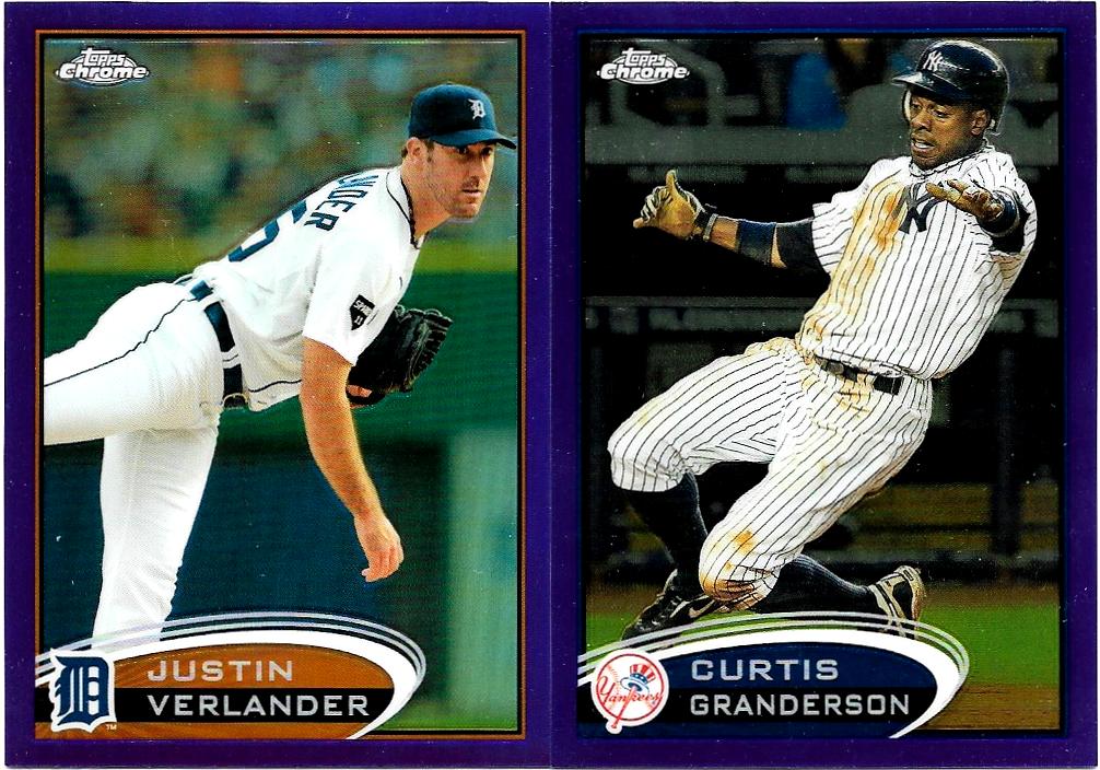
I've been thinking about starting a frankenset of Topps Chrome colored refractors, if I do, these 2012 purple's would certainly be a nice addition.
Attack of the random photo! This image was apparently captured while taking the pictures for this post. It was kind of funny to see it among the uploaded photos, especially since I don't remember taking it.
Of all the photos/scans in this post, I think this one of the 2011 Topps Diamond Anniversary's turned out best. I mean just look at those colors!
The orange Cutch refractor would be a nice addition to the possible frankenset as well. I've also toyed with the idea of starting one for sepia refractors too, even though that one would be a pretty slow build, as I wouldn't want to pay more than 25 cents each for the cards that went in to the set. I only found one of the sepia's on Saturday, that being the Cashner above, which is numbered to /99.
One of my card show objectives was to try and help
Chris out with his 2015-16 Donruss basketball set build, which by the way, I failed miserably in my attempt to do so. I did find two non-base cards from the set though, an Inspirations Die-Cut (#'d to /80) and an Elite Dominators, both of which are inserts/parallels that I'm working on. And don't worry about Chris, because I did end up finding a few other cards for him :)
I came across my first 2017 Topps Chrome Negative Refractor on Saturday as well. I don't anything about young Mr. Marquez, but it sure is an attractive card... scanned pretty well too!
I couldn't get a good picture of these 2015 Topps High Tek's either, but they seemed to have scanned pretty good. I know the background patterns have different names and are of different scarcities, but I couldn't tell you what's what, I just bought them because they were different. I'm always amazed that cards numbered to /50, can be had for just a quarter.
Tim Brown comes from that 2015 Topps High Tek set as well, but he's probably considered to be less special, what with him being numbered to /99 and all.
If I had pick favorites, I'd probably say these 1999 Pacific Prism parallels were my favorite cards from this post, mostly just because I can count on one hand the number of times that I have come across these at a card show. This was back when parallels that were serial numbered and had names like holographic gold, or holographic purple, seemed to be really cutting edge... and in many ways they were, in retrospect, Pacific really was ushering in a new era for trading cards.
Thanks for taking a moment to look at my page.


I forgot how nice the shiny 2011 Lineage were.
ReplyDeleteIt's easy to forget such things after seven years.
DeleteGotta love all that shine!
ReplyDeleteGotta love all that shine!
ReplyDeleteI certainly do!
DeleteLots of shiny in this post -- but, better yet, shiny you almost never see these days. I think I own exactly one of those Score Artist's Proof parallels (Darryl Kile), same goes for the Prism parallels (John Olerud, and I'm pretty sure mine is numbered to 480 copies). I'm always on the lookout for more of those kinds of things at shows but they rarely turn up.
ReplyDeleteIt's been so long since I last came across one of the Prism's, that I had forgot all about them.
DeleteMy favorites were the three Score Artist Proofs you led off with. Beautiful cards.
ReplyDeleteI don't know how I've gone this long without having never seen one.
DeleteCutch! Killer! Petro! Great stuff in this post too, especially the Archives Reserve. I don't know how often Judson (My Cardboard Habit) comes around, but every time I see a post by "J. Meeks" I'm tempted to call him Jodie. :D
ReplyDelete"And don't worry about Chris, because I did end up finding a few other cards for him :)" ohhh is that right? :D You're the best, Jon.
I don't think he knows of my blog's existence.
DeleteHopefully you'll still feel the same after the package arrives :)
That's a fantastic bunch of shinies! Though you wouldn't expect it I'm partial to the Granderson and Verlander Refractors.
ReplyDeleteI've always loved 90s parallels like those Artist's Proofs, and the Archives Reserve product was amazing too (which is why you don't see it anymore, because Topps)
90's inserts and parallels will never be topped, and that goes for all sports. Thankfully there are still plenty of them out there that can be had on the cheap.
Delete